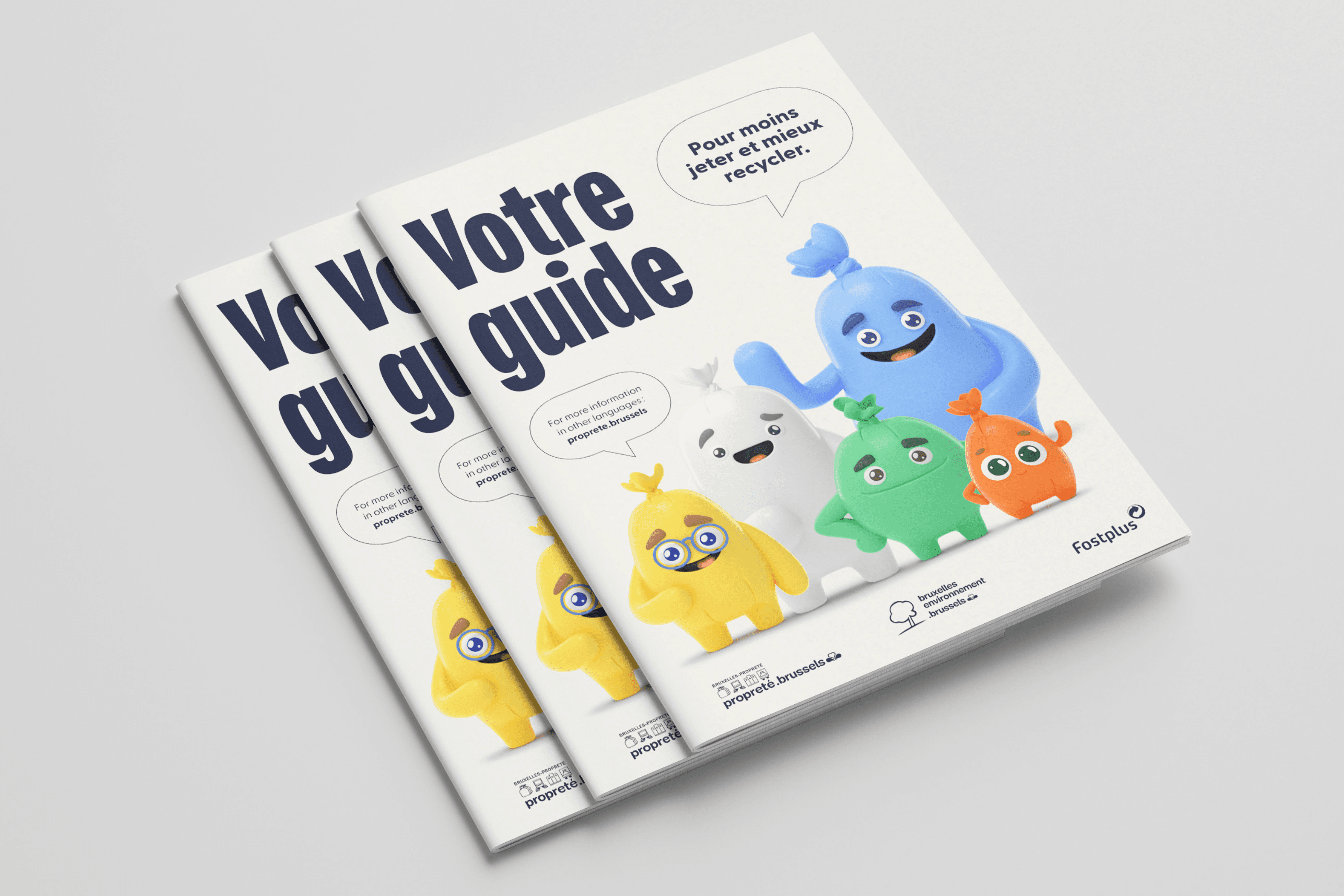
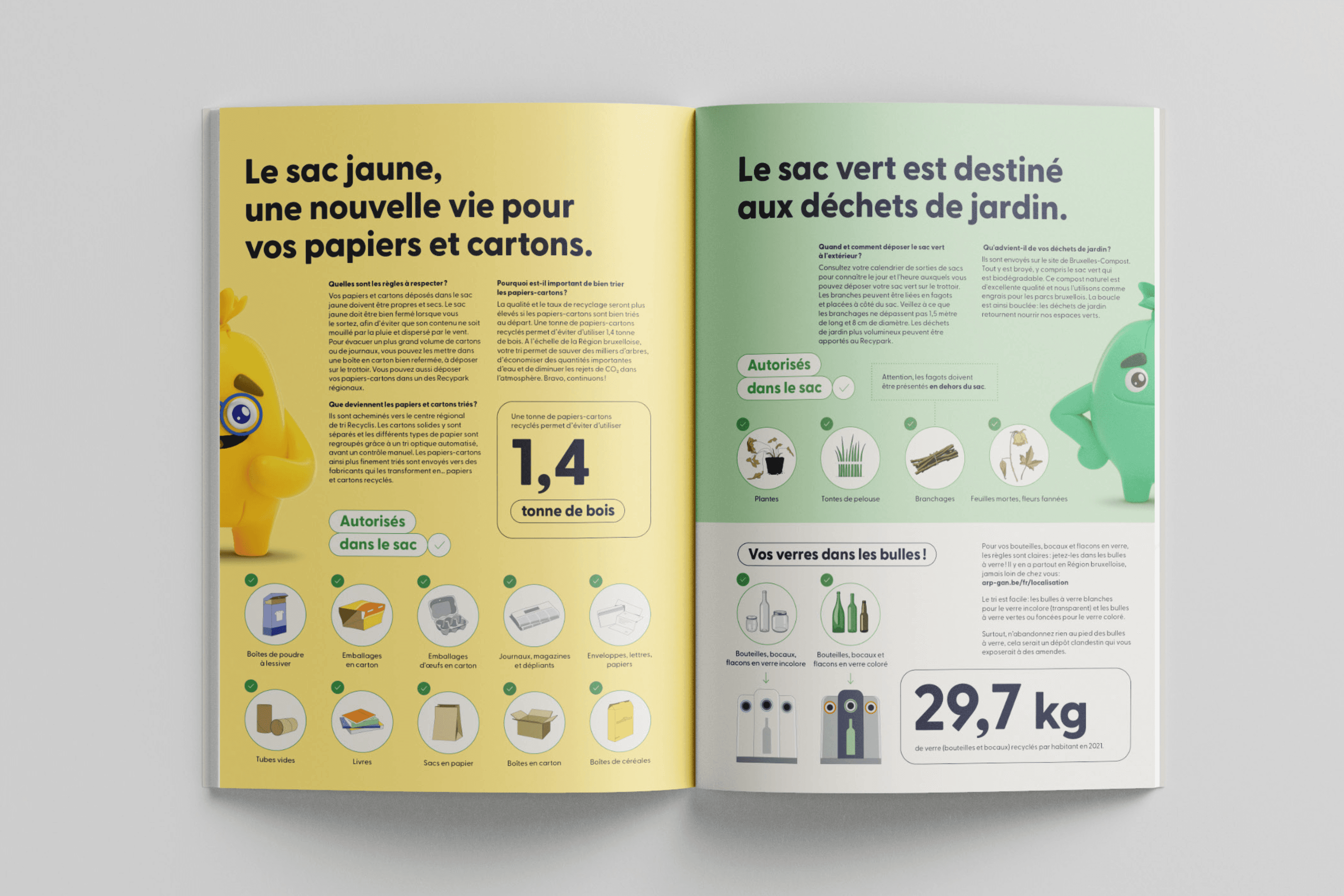
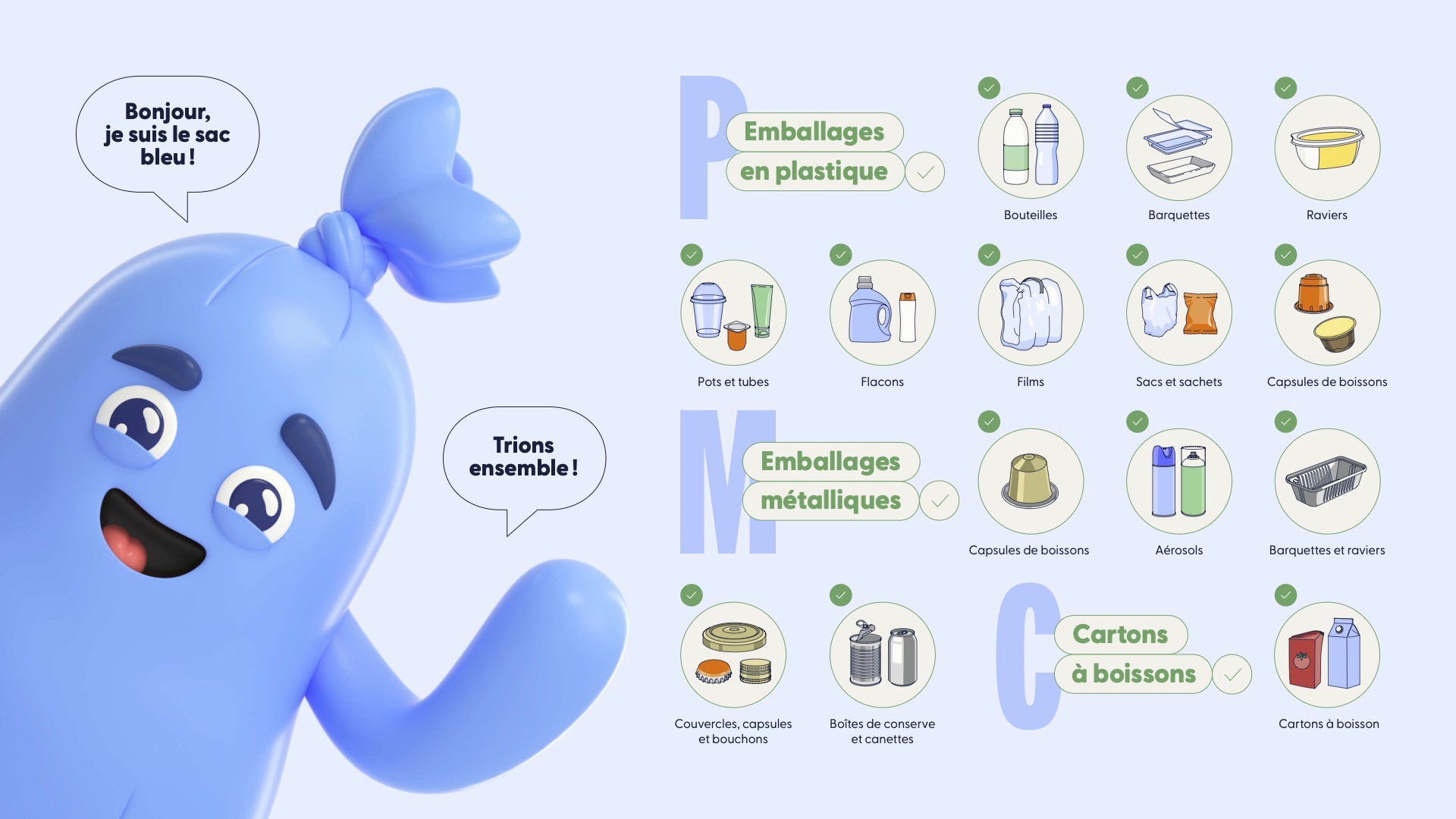
Waste sorting doesn't have to feel like a lecture. Bruxelles Propreté already had its mascots. One per bag type, built by an Argentine 3D designer and needed an identity that could carry the information without carrying the fatigue.
We selected the font to match the tone: rounded, almost childlike, so the essentials read in a glance. A second, louder typeface handles the onomatopoeia — the *pfft*, the *clonk* — because attention, in this line of work, has to be earned one sound effect at a time.
The branding initially developed here was broadened into becoming the visual identity system of Bruxelles Propreté as a whole.