
Sonop
Sonop
Year
2011
2011
Client
Zannier
Zannier
Sector
Hospitality
Hospitality
Project type
New Brand
New Brand
Team
Astrid Verdeyen
Carole Mannekens
Astrid Verdeyen
Carole Mannekens
Zannier found us — client since 2009, before SIGN had much of a track record to point to. It started with a restaurant a fashion-house family bought and turned into a chalet: sixteen rooms, then more, then a name that would need to travel.
Every time a new resort opened — Cambodia, Vietnam, Namibia — Zannier didn't hand us a brief so much as an invitation: come document the place before you design anything. Local craftsmanship, local materials, local architecture — the identity had to grow out of the ground it stood on, the same way the hotel itself used local staff and local building techniques instead of importing a formula.
In Vietnam, By Sano became a small universe of its own — three restaurants, a spa, residences, each with its own aesthetic pulled from local construction methods. In Namibia, Sonop went further back: a 19th-century safari story told through robust tents, period typography, and characters who never existed but earn their place in the mythology anyway. Omanda's logo came from traditional Namibian wood engraving. Bandor holds two hotels and three restaurants under one brand architecture, its logo drawn from the Bandor cross, its imagery borrowed from a Côte d'Azur that belongs, quite literally, to the family who owns the island.
Fifteen-plus years in, and the brief is still the same one it always was: go look first, then design.
Zannier found us — client since 2009, before SIGN had much of a track record to point to. It started with a restaurant a fashion-house family bought and turned into a chalet: sixteen rooms, then more, then a name that would need to travel.
Every time a new resort opened — Cambodia, Vietnam, Namibia — Zannier didn't hand us a brief so much as an invitation: come document the place before you design anything. Local craftsmanship, local materials, local architecture — the identity had to grow out of the ground it stood on, the same way the hotel itself used local staff and local building techniques instead of importing a formula.
In Vietnam, By Sano became a small universe of its own — three restaurants, a spa, residences, each with its own aesthetic pulled from local construction methods. In Namibia, Sonop went further back: a 19th-century safari story told through robust tents, period typography, and characters who never existed but earn their place in the mythology anyway. Omanda's logo came from traditional Namibian wood engraving. Bandor holds two hotels and three restaurants under one brand architecture, its logo drawn from the Bandor cross, its imagery borrowed from a Côte d'Azur that belongs, quite literally, to the family who owns the island.
Fifteen-plus years in, and the brief is still the same one it always was: go look first, then design.
Other projects
Other projects

1898
Brand architecture for a growing hotel family in Ghent.
Hospitality

TPF
A corporate rebranding and website for an international infrastructure group.
Legal & Consulting
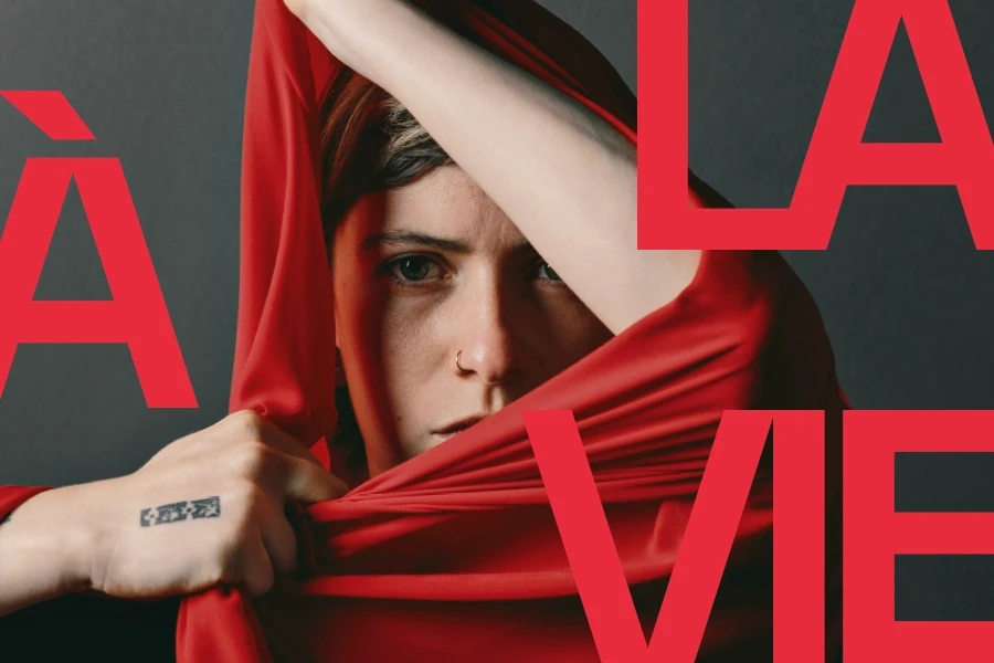
Scène Nationale du Sud-Aquitain Saison 26 | 27
"À la vie, à la mort": a season for a theatre in transition.
Art & Culture

Pietrasanta in Concerto - 2026 Edition
A reworked website for a Tuscan music festival.
Art & Culture

De Moor Advocaat & Kriek
Packaging for a spirits range, cut to show the contents
Food & Beverage
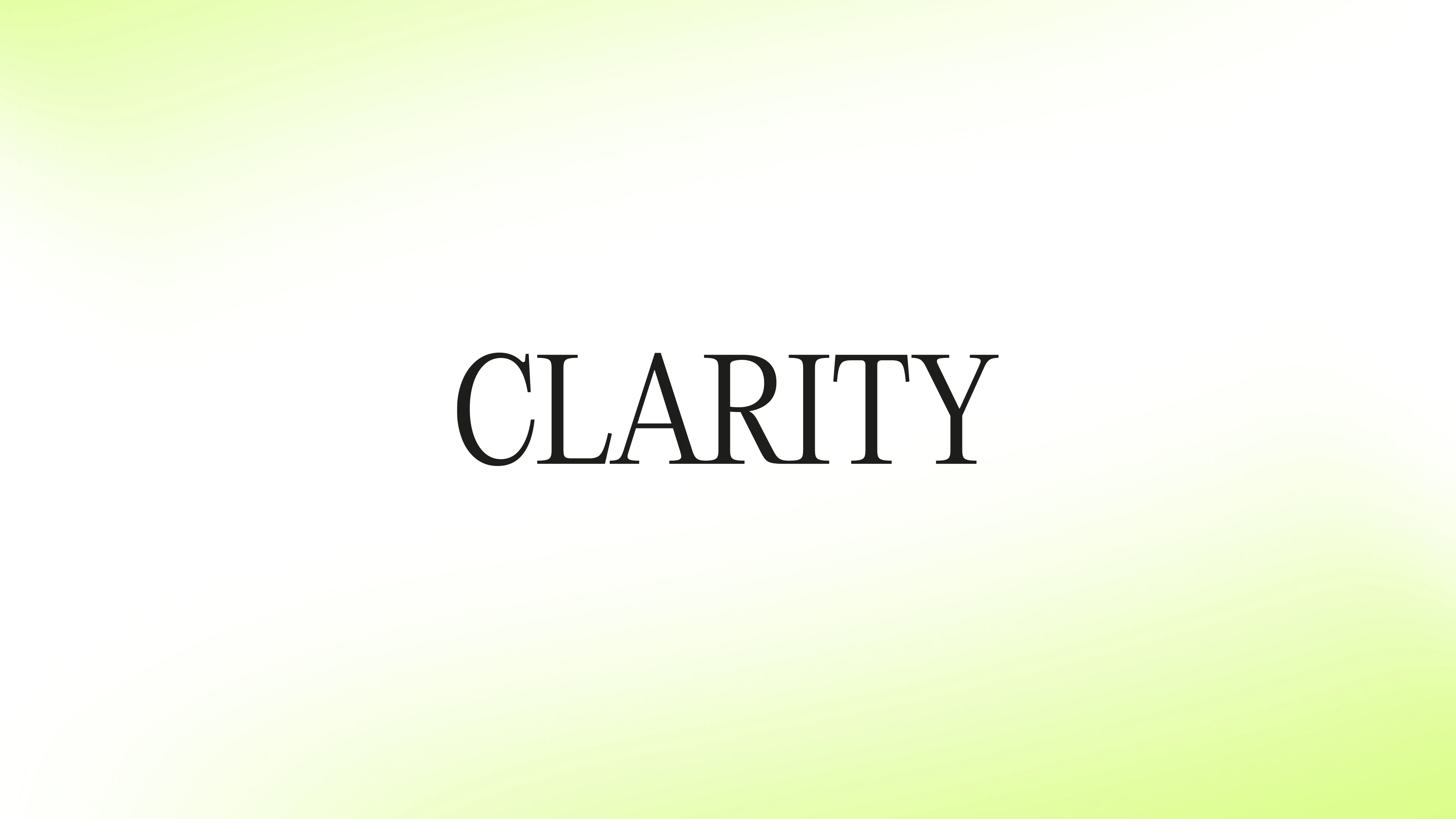
Clarity Legal
Naming a law firm around the thing its clients value most.
Legal & Consulting
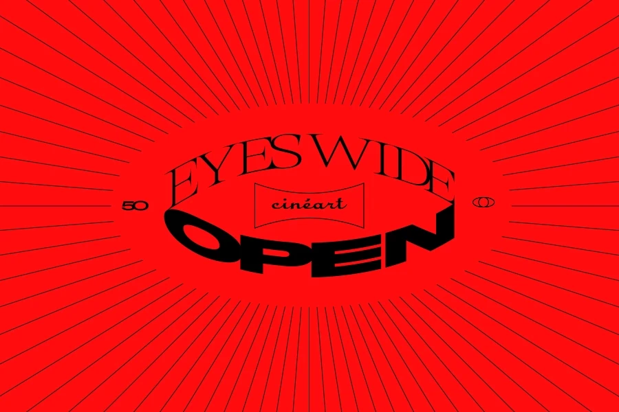
Cinéart 50th Anniversary
Fifty years of cinema, brought together in one book.
Art & Culture

Île de Bendor
One island, one cross, three very different addresses.
Hospitality

Île de Bendor - Le Grand Large
A fine-dining identity for a restaurant that changes chef.
Hospitality

Île de Bendor - Delos
A hotel identity drawn on a 1950s silk scarf.
Hospitality

Île de Bendor - Soukana
A modern hotel identity with an Asian accent.
Hospitality
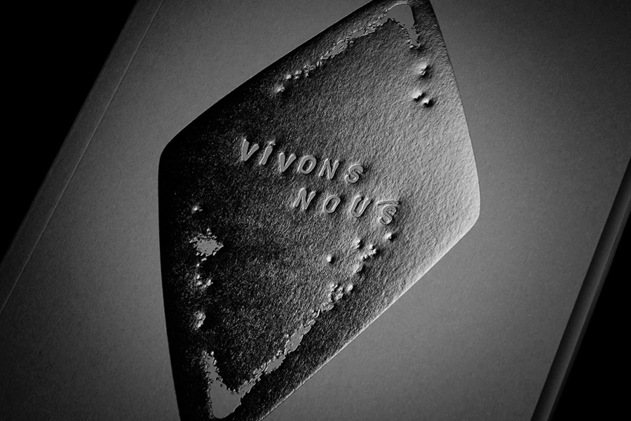
BeCraft - Claire Lavendhomme
Giving contemporary craft its own publication.
Art & Culture

Anglet Culture
One letter, endless exhibitions.
Art & Culture

Scène Nationale du Sud-Aquitain Saison 25 | 26
Punctuation as narration: question, then answer.
Art & Culture

Anglet - Biennale
An outdoor art biennial built from one diagonal.
Art & Culture

Vocatio
Giving a foundation that believes in people a name young talent actually recognises.
Art & Culture

Scène Nationale du Sud-Aquitain Saison 23 | 24
Photography, ambiguity, and an audience left to imagine the rest.
Art & Culture

Magazine 14
Opening the Port to the city through stories, people and projects.
Civic
Publishing

Bruxelles Propreté - Campagne "Tri des déchets"
Making waste sorting playful, one mascot at a time.
Civic

D'Ieteren Luxury Performance
Giving a luxury portfolio its own quiet authority.
Premium

Vivalis
Naming and a clearer identity for public health and social prevention.
Civic

De Moor Liqueurs
Extending De Moor’s visual world into liqueur.
Food & Beverage

Electrify.brussels
Making electric charging feel like part of everyday Brussels.
Civic

Nonna Bazaar
A convivial hospitality concept, from Menorca to Île de Bendor.
Hospitality
1898
Brand architecture for a growing hotel family in Ghent.
Hospitality
TPF
A corporate rebranding and website for an international infrastructure group.
Legal & Consulting
Scène Nationale du Sud-Aquitain Saison 26 | 27
"À la vie, à la mort": a season for a theatre in transition.
Art & Culture
Pietrasanta in Concerto - 2026 Edition
A reworked website for a Tuscan music festival.
Art & Culture
De Moor Advocaat & Kriek
Packaging for a spirits range, cut to show the contents
Food & Beverage
Clarity Legal
Naming a law firm around the thing its clients value most.
Legal & Consulting
Cinéart 50th Anniversary
Fifty years of cinema, brought together in one book.
Art & Culture
Île de Bendor
One island, one cross, three very different addresses.
Hospitality
Île de Bendor - Le Grand Large
A fine-dining identity for a restaurant that changes chef.
Hospitality
Île de Bendor - Delos
A hotel identity drawn on a 1950s silk scarf.
Hospitality
Île de Bendor - Soukana
A modern hotel identity with an Asian accent.
Hospitality
BeCraft - Claire Lavendhomme
Giving contemporary craft its own publication.
Art & Culture
Anglet Culture
One letter, endless exhibitions.
Art & Culture
Scène Nationale du Sud-Aquitain Saison 25 | 26
Punctuation as narration: question, then answer.
Art & Culture
Anglet - Biennale
An outdoor art biennial built from one diagonal.
Art & Culture
Vocatio
Giving a foundation that believes in people a name young talent actually recognises.
Art & Culture
Scène Nationale du Sud-Aquitain Saison 23 | 24
Photography, ambiguity, and an audience left to imagine the rest.
Art & Culture
Magazine 14
Opening the Port to the city through stories, people and projects.
Civic
Publishing
Bruxelles Propreté - Campagne "Tri des déchets"
Making waste sorting playful, one mascot at a time.
Civic
D'Ieteren Luxury Performance
Giving a luxury portfolio its own quiet authority.
Premium
Vivalis
Naming and a clearer identity for public health and social prevention.
Civic
De Moor Liqueurs
Extending De Moor’s visual world into liqueur.
Food & Beverage
Electrify.brussels
Making electric charging feel like part of everyday Brussels.
Civic
Nonna Bazaar
A convivial hospitality concept, from Menorca to Île de Bendor.
Hospitality
Hospitality